Why Your QR Code Won't Scan (And How to Fix It Before You Print)
Most codes that fail, fail for one of five ordinary reasons. None of them are the phone's fault, and all of them can be fixed before anything goes to the printer.
The MyPersonalQR team3 min read · 18 November 2025 · Design
You spent an evening on the poster. It looks great. Then a customer holds their phone up to the code, waits, tilts it, steps back, and gives up.
They won't try a third time. They will quietly decide your business doesn't have its act together, and you will never know it happened.
The frustrating part is that almost every failure comes down to a short list of things, and every one of them is decided before the file goes to print.
A code that doesn't scan is worse than no code at all.
It is printed too small
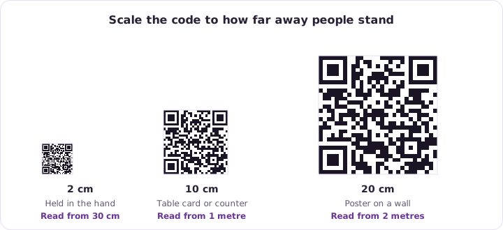
This is the most common one by a distance. A code looks fine at full size on a screen, then gets dropped into the corner of a leaflet at half the size it needs.
As a rough floor, keep it at two centimetres square for something held in the hand. For a poster read from across a room, scale up with the distance. A handy rule is that the code should be about a tenth of the distance people will scan it from.
There isn't enough contrast
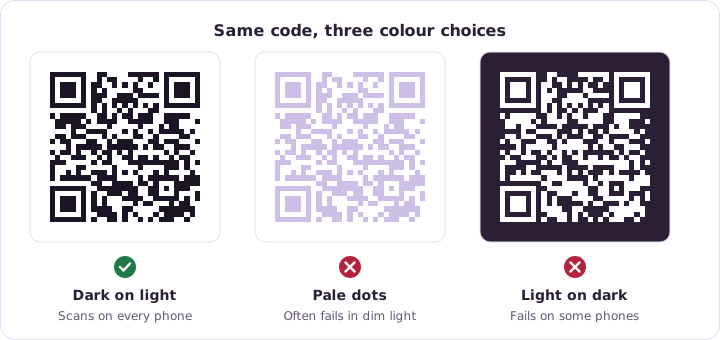
A camera has to tell the dark squares from the light background. Two mid tone colours that look lovely in a design tool can look almost identical to a phone in a dim room.
Dark on light is what scanners are built for. Light dots on a dark background work on many phones, but not all of them, so a light background is the safer bet every time.
- Keep the code darker than its background
- Avoid pale colours for the dots
- Never place a code over a busy photo
- Test in poor light, not just on your monitor
The empty border got cropped
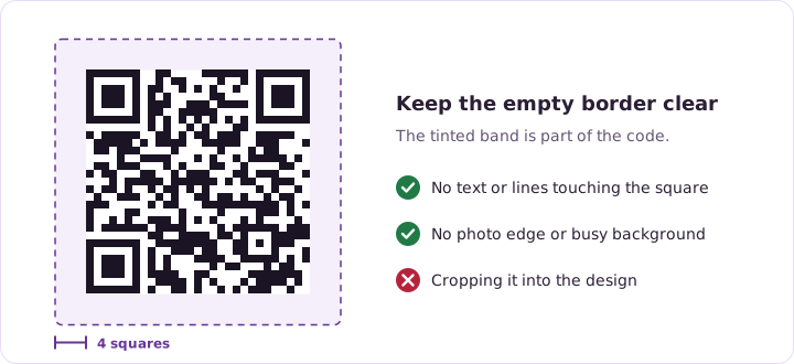
A code needs a clear margin around it, usually about four squares wide. That blank border isn't decoration. It is how a scanner works out where the pattern starts and ends.
Designers squeeze it all the time, because empty space looks like wasted space. It is the easiest way to make a perfectly good code unreadable.
The logo in the middle is too big
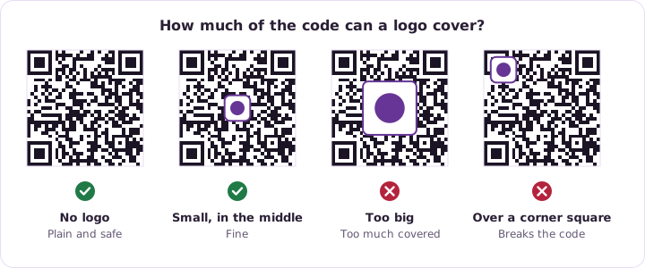
A logo in the middle works because QR codes carry error correction. Some of the pattern can be covered and the data still comes back. There is a limit, though, and covering much more than a third of the code goes past it.
Keep the logo central. The three big squares in the corners and the lines between them are what a scanner locks onto first, so anything covering those breaks the code outright.
There is too much inside it
For a static code, everything you encode lives inside the pattern. A long web address with tracking bits on the end makes a dense, fragile code full of tiny squares that smudge in print.
Shorten the address before you encode it, or use a dynamic code, where the pattern only ever holds one short link however long the real destination is.
Test it properly before you print
Trying it on your own phone, on screen, at full brightness isn't a test. That is the easiest possible conditions, and it will pass almost anything.
- Print it at the real, final size
- Try it on an old phone and a new one
- Scan it in the light it will actually live in
See how this applies to Static QR Codes.
Try it on a code of your own. It takes a few minutes.